Mobile apps are now indispensable in real estate. With over 70% of property searches happening on mobile devices, usability directly impacts productivity and client satisfaction. Poorly designed apps can frustrate users, with 55% abandoning apps after one use due to navigation issues. For real estate professionals managing dozens of transactions annually, the right app can save 2–3 hours per deal by automating tasks, improving communication, and ensuring access to property data – even offline.
Key takeaways for better usability:
- Simple design: Keep interfaces intuitive with clear navigation, predictive search, and advanced filters.
- Consistency: Maintain uniform layouts and use familiar gestures like swipe-to-pan or pinch-to-zoom.
- Responsiveness: Ensure fast loading times, offline caching, and progressive image loading to handle high-resolution property photos.
- Critical features: Include interactive maps, real-time notifications, and virtual tours to boost engagement and efficiency.
Apps that prioritize these principles can increase property viewings by 60%, extend session times by up to 40%, and improve conversion rates by 40%. Whether you’re building or refining a real estate app, usability is the foundation for success.

Mobile App Usability Statistics for Real Estate Professionals
Usability testing and redesign of a mobile application for real estate
sbb-itb-99d029f
Core Usability Principles for Real Estate Mobile Apps
Real estate professionals need tools that keep up with their fast-paced workflow. When you’re managing multiple properties and fielding client calls between showings, every second matters. The difference between an app that supports productivity and one that slows you down boils down to three essential principles: simplicity, consistency, and responsiveness. Let’s dive into how these principles translate into better design and functionality.
Simple and Intuitive Design
A well-organized interface allows agents to focus on their main priority – closing deals. Property listings and search tools should take center stage on the screen, with clear visual markers to separate categories and features [4]. Bottom navigation bars are ideal for keeping key menu options within easy reach, while sticky action buttons like "Search" or "Call" ensure critical functions stay accessible as users scroll through listings [3][5].
"Clarity and simplicity are essential principles in real estate UI/UX design. Focus on creating a simple and understandable real estate app design interface by minimizing complexity and eliminating unnecessary elements." – Cygnis [4]
Features like predictive search and autocomplete reduce the need for excessive typing, making the experience smoother. Advanced filters for details like HOA fees or construction year can remain hidden under toggles to keep the layout uncluttered [3][5]. To maintain speed and responsiveness, using WebP format for images and implementing lazy loading ensures high-resolution photos load only when users view them [3]. The ultimate goal? First Contentful Paint under 1 second and Time to Interactive under 3 seconds [3].
Consistent Design and Navigation
Consistency in design ensures users can navigate the app without confusion. For instance, property pages that follow a structured format – showing photos, key facts, and descriptions in the same order – help eliminate guesswork and frustration [5][6][8].
"Consistency is the key to success in real estate app design as users interact with the product through various devices and platforms." – Cygnis [4]
Leveraging familiar mobile gestures, like pinch-to-zoom and swipe-to-pan, builds on habits users already have from apps like Google Maps [7][3]. This familiarity reduces the need for extensive onboarding and lets users get to work immediately. Breadcrumb trails also play a crucial role, helping users navigate complex app structures and backtrack easily through multiple property searches [4][3].
Beyond maintaining uniformity, ensuring accessibility across different use cases further enhances the app’s effectiveness.
Accessibility and Responsive Interfaces
Real estate apps are used in all kinds of environments – outside a property, in a car, or even in areas with poor cell service. Progressive loading, which displays low-resolution placeholders while high-quality images load in the background, keeps the app feeling quick, even on slower networks [2].
"Users won’t wait more than three seconds for an image to load before they move on to the next listing, which means you’re potentially losing interested buyers simply because your app is too slow." – We Are Affective [2]
Offline caching of the last 50 viewed properties is another game-changer, increasing session times by 40% [2]. This feature ensures agents can access property details even in areas with weak signals. Additionally, all interactive elements should have a minimum tap target size of 44×44 pixels to ensure they’re easy to use on smaller screens [2]. Bandwidth detection can further enhance usability by adjusting virtual tour quality based on the user’s current connection speed [2].
Key Features That Improve Usability in Real Estate Mobile Apps
Now that we’ve laid out the basic principles, let’s dive into the features that can make real estate apps incredibly user-friendly. These tools don’t just enhance functionality – they create a smoother experience for users.
Efficient User Onboarding
Getting users into the app quickly is a must. Features like social media login, email, or phone verification simplify the signup process and eliminate unnecessary steps [10]. The goal? Get users to the property listings as fast as possible. Long forms and multi-step verifications often lead to frustration and drop-offs, so keeping it simple is key.
Property Search and Filtering Tools
Search filters are the backbone of any real estate app. Users should be able to refine their searches by criteria like price, property type, and number of bedrooms [2][11]. Advanced filters that adjust dynamically – based on what users select – help avoid dead-end searches. Adding voice search is another way to make the process even faster [3].
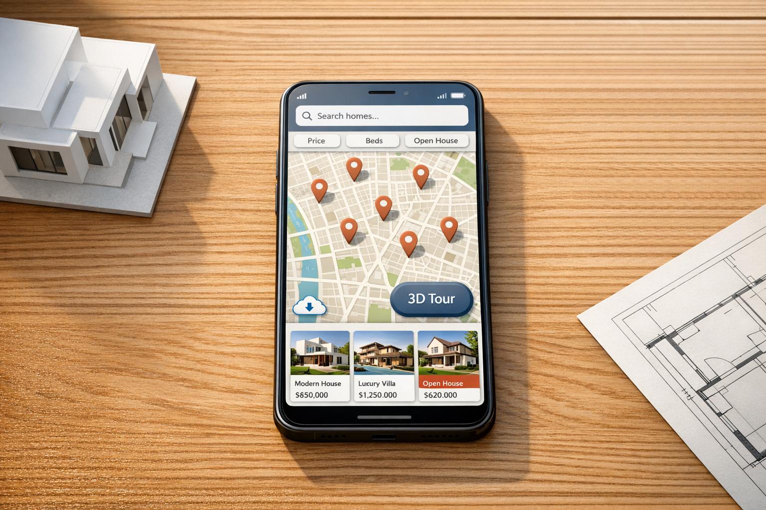
Interactive Maps and Location Features
Maps are more than just a nice-to-have; they’re essential for giving users geographic context. Features like map-based searches with pins or cluster markers make it easy to scan entire neighborhoods [2]. Showing prices directly on map markers saves users from having to click on each listing. For more precision, tools like custom polygon drawing let users define specific areas they’re interested in, such as zones near schools or workplaces [2][3]. Geolocation capabilities are especially handy for surfacing nearby properties during tours.
"Location is not just a filter, it is the foundation of the decision." – Raw.Studio [7]
For real estate professionals, platforms like CoreCast combine map-based property tracking with deal management, offering a clear view of both active transactions and the competitive landscape.
Property Details and Virtual Tours
When it comes to property details, visuals are everything. Swipeable, high-resolution photo galleries with pinch-to-zoom functionality are a given, but adding 3D and 360-degree virtual tours takes it to the next level [10][2]. These tools let users explore properties remotely, which is especially valuable for out-of-town buyers. In fact, 70% of homebuyers value virtual tours as much as attending an open house [10]. And here’s a fun stat: 73% of users zoom in on kitchen and bathroom photos, so make sure those images are top-notch [2].
"Rich media, like these new 3D Homes, will help buyers and renters more easily visualize themselves living in the home, no matter how far away they happened to be." – Jeremy Wacksman, CMO, Zillow Group [10]
Virtual tours aren’t just a cool feature – they can boost conversion rates by up to 40% [2].
Push Notifications and Real-Time Updates
Timing is everything in real estate. In markets where properties can go under contract in less than 48 hours, real-time alerts make all the difference [12]. Push notifications for price changes, new listings, or updates on saved searches keep users in the loop without requiring them to constantly check the app [12]. Compared to email, which often gets filtered or ignored, push notifications have an open rate of 50–80%, far outperforming the 15–25% seen with real estate emails [12].
"In a market where properties move in hours, not days, that gap in response time is critical." – Jocelyn Kaufman, Brick & Yield [12]
To prevent users from feeling overwhelmed, allow them to customize notification settings. Options like instant alerts or daily digests give users control while minimizing notification fatigue. Using deep linking ensures that notifications take users directly to the relevant property details, rather than a generic homepage [12].
Best Practices for User-Focused Design in Real Estate Apps
In the world of real estate app design, achieving the right mix of visual appeal and functionality is key. These apps must not only look good but also handle large amounts of data efficiently. By prioritizing simplicity and consistency, designers can create tools that offer both clarity and usability.
Balancing Visual Design and Functionality
Real estate apps face a unique challenge: they must manage complex data while remaining visually engaging. Unlike e-commerce apps, where speed and quick transactions are priorities, real estate apps serve as decision-making tools where clarity and confidence matter most [6]. Striking this balance is essential.
A good starting point is establishing a clear visual hierarchy. Highlight critical details like price, square footage, and location prominently. Avoid burying these essentials in lengthy text [9]. Use color to group content effectively, and ensure fonts are easy to read – even in bright outdoor settings when users might be exploring neighborhoods [9].
For interfaces packed with data, a layering approach works well. Show summary information first, then let users tap to access deeper details through expandable sections. This approach reduces mental effort while keeping detailed insights accessible [6]. Additionally, optimize high-quality visuals like 3D tours and HD photos using techniques such as lazy loading and WebP formats to maintain app speed [9][2].
"The best real estate app design doesn’t just show properties; it helps users imagine their life in those spaces through thoughtful presentation of visual content and contextual information."
– We Are Affective [2]
Designing for mobile usability is also critical. Position interactive elements like search bars, filters, and shortlists at the bottom of the screen for thumb-friendly navigation. This is especially important since 80% of users aged 41–55 rely on mobile or tablet devices for property searches [13]. Ensure tap zones are at least 44×44 pixels to prevent accidental taps [2].
Once the interface is visually optimized, the next focus should be on creating efficient workflows.
Designing for Workflows and Task Efficiency
Beyond aesthetics, real estate apps must streamline workflows to save time and improve productivity. Real estate professionals typically spend only 30% of their time on revenue-generating tasks like negotiating deals, while 70% is consumed by administrative tasks and data entry [16]. Apps designed with these workflows in mind can help reduce this imbalance.
Start by mapping the entire transaction process to identify where manual steps slow things down [15]. Build features that eliminate these delays. For instance, integrating CRM, email, and calendar tools can remove the friction of switching between platforms, allowing agents to have a complete client history readily available [14][17].
Automation can also play a big role. Focus on automating repetitive tasks like generating listing descriptions, scheduling follow-ups, or creating meeting transcriptions [17]. Consider the example of Sarah Martinez, a solo real estate agent in Austin, Texas. By adopting an AI-powered tech stack in 2025, she cut her weekly administrative workload from 22 hours to just 3 hours – a reduction of 82%. This allowed her to increase her active listings from 8 to 12 and respond to leads in just 3 minutes instead of 2 hours [16].
"I was skeptical about AI replacing my personal touch. But it doesn’t replace me – it multiplies me."
– Sarah Martinez, Real Estate Agent [16]
To maintain a smooth user experience, use progressive loading for images. Display low-resolution placeholders first while high-resolution versions load in the background [2]. This is crucial since users are unlikely to wait more than 3 seconds for a property image to load before moving on [2]. For map-based searches, implement debouncing – wait about 300ms after a user stops panning before sending a new server request. This approach saves battery life and reduces server strain [2].
Platforms like CoreCast simplify workflows by integrating underwriting, pipeline tracking, and portfolio analysis into one interface. This eliminates the need for juggling multiple tools, giving professionals the full context they need to make faster decisions.
Touch vs. Gesture-Based Navigation
Combining touch and gesture controls can enhance user interactions by aligning the navigation style with the task at hand. Touch navigation works well for precision tasks, while gestures are better suited for exploration.
| Feature | Touch-Based Navigation | Gesture-Based Navigation |
|---|---|---|
| Primary Use | Menus, CTAs, filter selection, form input | Photo galleries, map panning, virtual tours |
| Pros | High precision; familiar UI patterns; clear visual feedback | Immersive; intuitive for spatial exploration; reduces clutter |
| Cons | Can clutter small screens; prone to "fat finger" errors | Less discoverable and may trigger accidentally |
| Best Practice | Minimum 44x44px tap zones; sticky bottom menus [13][2] | Pinch-to-zoom; haptic feedback; gyroscope support for 360° views [2] |
For core navigation items like Search, Favorites, and Profile, place them in a bottom navigation bar to make one-handed use easier on larger smartphones [3]. When it comes to browsing, opt for "Load More" buttons instead of infinite scrolling. While infinite scrolling can boost engagement, "Load More" provides better control and reduces memory strain when viewing extensive property lists [2].
Always include visual cues for gestures, such as arrows or scrolling indicators in carousels, to show users that additional content is accessible through swiping [2]. Since gestures can be hard to discover for new users, offer touch alternatives like navigation arrows. For critical actions like scheduling a tour or submitting an offer, rely on clear, touch-based buttons with immediate visual feedback.
Testing and Improving Usability for Real Estate Apps
A real estate app isn’t just about looking good – it has to work seamlessly, too. Testing helps uncover user pain points, while analytics provide a behind-the-scenes view of how people interact with your app. Together, they help you fine-tune your app into something users will keep coming back to.
Usability Testing Methods
To really understand how users interact with your app, it’s best to combine different testing methods. Moderated usability testing is great for more complex features like mortgage calculators or early prototypes. In this method, a researcher guides participants through tasks in real time, gathering detailed feedback. On the other hand, unmoderated remote testing lets users complete tasks independently on their own devices, which is ideal for quickly validating specific features like property search filters [18][20].
Studies show that testing with just 5 users per flow can uncover most major usability issues [18]. Focus on testing high-priority actions like property searches, filtering options, navigating between listings, and saving properties to "Favorites" [18][19].
Task-based assessments are another powerful way to measure usability. For example, you might ask users to "find a pet-friendly apartment under $2,000" or "save a property to favorites." These tasks help identify any friction in the user journey. In a usability review of five real estate apps, Homesnap scored the highest (15.5/20) for task success rates and completion times, while Apartments.com lagged behind with an 11/20 score [19].
"Usability testing won’t tell you whether your product is needed, it excels at revealing how well it’s executed."
– Dmytro Trotsko, Senior Marketing Manager, Excited Agency [18]
Final testing on actual devices is crucial to assess touch responsiveness and network performance [20]. Using a "think-aloud" protocol – where users verbalize their thoughts while navigating – can also reveal the reasoning behind their actions [20]. When documenting findings, categorize issues by severity and prioritize fixes for problems that block task completion and are easy to resolve [18].
These insights fuel ongoing improvements, which analytics help monitor and refine.
Using Analytics for Continuous Improvement
Pairing usability testing with real-time analytics ensures your app stays user-friendly and effective for real estate professionals. Analytics pinpoint underperforming areas, while qualitative tests explain user behavior [18]. Start by setting baseline metrics like loading times, navigation flows, and bounce rates so you can measure improvements over time [3].
Technical performance is a key focus. With over 70% of property searches happening on mobile, metrics like First Contentful Paint (FCP) and Time to Interactive (TTI) are critical for keeping users engaged [3].
Tools like heatmaps and session recordings (via platforms like Hotjar or FullStory) help visualize how users interact with your app. These tools can reveal bottlenecks, such as repeated taps on unresponsive elements or high drop-off rates on specific screens. For real estate apps, tracking "Listings Viewed per Session" gives you a clear sense of how well your navigation and search tools work [3].
Pay attention to which filters users interact with most – such as price, pet policies, or amenities – and make those filters easy to find [19]. If analytics show users abandoning the sign-up process, consider simplifying it with social login options (like Google or Facebook) or reducing the number of mandatory fields [19]. Another helpful tip: cache users’ past search queries. Since property searches often span weeks or months, this feature can save users time and effort [19].
"Analytics… are great for showing which areas of your mobile app are underperforming, but they often won’t tell you why."
– Dmytro Trotsko, Senior Marketing Manager [18]
Conversion metrics, like the percentage of users completing inquiries or sign-ups, are also worth tracking. These metrics validate whether your property detail pages are effective [3]. For platforms with multiple workflows – like CoreCast, which supports underwriting, pipeline tracking, and portfolio analysis – analytics can show which features users find most valuable and where they need additional guidance to fully utilize the platform.
Conclusion
With over 70% of property searches happening on mobile devices, ensuring seamless usability is no longer optional – it’s essential to retaining clients [3]. This guide lays out clear steps for designing or evaluating apps that genuinely meet user needs.
The basics are non-negotiable: simple navigation, loading times under three seconds [3], and intuitive, thumb-friendly layouts. A map-based search should be the star feature, allowing users to explore properties with ease through smooth gestures and smart clustering. Additional features like fast-loading photo galleries and well-optimized filters further enhance the user experience [2].
The impact of these improvements is measurable. For example, integrated booking systems can lead to a notable increase in bookings [2], while upgraded photo galleries can extend user session times by up to threefold. Even small additions, like a "Request More Photos" button, have been shown to increase inquiries by 28% [2].
As the real estate industry embraces technology, the pace of change is accelerating. Over 80% of stakeholders plan to boost their tech investments in the next three years, with 86% of European investors focusing on digital solutions [1]. Features like offline caching, built-in financial calculators, and AI-driven property recommendations are quickly becoming standard, not optional extras.
Whether you’re enhancing an existing app or creating one from scratch, sticking to these principles will deliver tangible results. By focusing on usability, performance, and streamlined workflows, tools like CoreCast demonstrate how consolidating multiple processes – such as underwriting, pipeline tracking, and portfolio analytics – into one platform can transform the user experience. Prioritize performance, understand your users’ workflows, test frequently, and rely on analytics for ongoing improvements. The payoff? Happier users and better outcomes.
FAQs
What are the must-have features in a real estate mobile app?
A well-designed real estate app needs to offer tools that make property hunting seamless and convenient. Here are some of the must-have features:
- Advanced Search Filters: Users should be able to narrow down their options based on factors like location, price range, and property size. This ensures they can find exactly what they’re looking for without wasting time.
- Interactive Maps: Maps are essential for visualizing property locations and exploring nearby amenities like schools, parks, and restaurants.
- Real-Time Updates: Keeping users informed about changes in availability and pricing is crucial, especially in competitive markets where timing matters.
- Detailed Property Listings: High-quality photos, property descriptions, and key details (like square footage and number of bedrooms) help users make informed decisions.
- Secure Communication Tools: Built-in messaging allows potential buyers or renters to connect with agents or property owners directly without compromising privacy.
- Payment Processing: For rental apps, secure payment options streamline transactions and make the process more convenient.
To elevate the user experience, consider features like virtual tours for remote viewing, a favorites section for saving top picks, and social media integration for easy sharing with friends and family. These extras can make the app more engaging and user-friendly.
How fast should a real estate app load on mobile?
A real estate app needs to load in under three seconds on mobile devices. Why? Because more than half of mobile users will leave if it takes any longer. Quick load times not only keep users engaged but also boost conversion rates, making speed a key factor for both user experience and overall success.
What should I track to measure app usability improvements?
To truly understand how your app performs, it’s essential to monitor both quantitative and qualitative metrics. Here are some key indicators to focus on:
- Task success rate: How often users can complete a specific action or goal without issues.
- Loading times: The speed at which your app responds, as delays can frustrate users.
- Navigation efficiency: How easily users can move through your app to find what they need.
- User satisfaction metrics: Tools like the Net Promoter Score (NPS) can reveal how likely users are to recommend your app.
Beyond these, pay close attention to in-app feedback, user behavior patterns, and feature adoption rates. These insights can expose areas where users might struggle or identify features they love. For instance, tracking task efficiency – like how quickly users complete workflows such as property searches – can pinpoint where usability can be improved.