Real estate dashboards simplify complex data, helping professionals make faster, better decisions. The key is aligning the right data with the right user through clear, functional design. A good dashboard:
- Consolidates data from tools like CRMs, property management, and financial platforms.
- Focuses on role-specific metrics (e.g., IRR case studies for investors, occupancy rates for operators).
- Uses clean layouts, intuitive visuals, and interactive features like drill-downs.
- Avoids clutter by prioritizing essential KPIs and grouping related data.
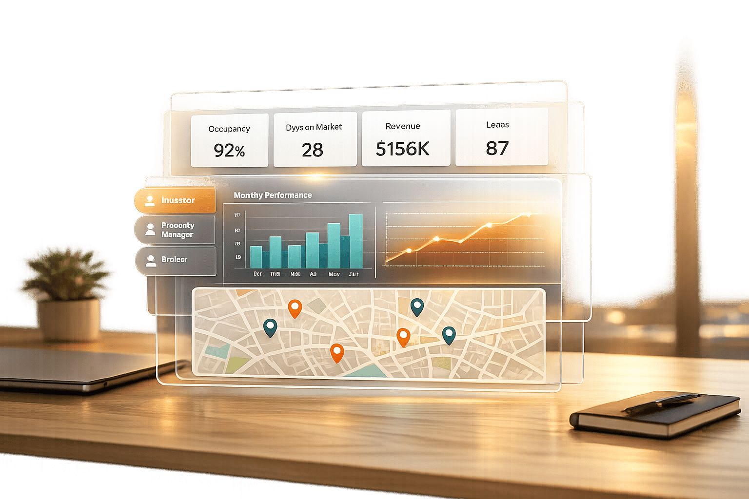
How to build a custom real estate dashboard
When building your own, it helps to understand the top features of real estate intelligence dashboards that drive user adoption.
sbb-itb-99d029f
Understanding User Needs and Setting Clear Goals
Designing dashboards that deliver actionable insights starts with putting the user at the center. Before deciding on charts or data layouts, it’s crucial to understand who will use the dashboard and the decisions they need to make. For instance, a dashboard for an investor tracking portfolio returns will look completely different from one tailored for a facility manager monitoring repair costs. The key is aligning the data to fit each user’s decision-making process.
Identify Key Stakeholders and Their Roles
Real estate professionals come with diverse priorities and responsibilities, meaning their dashboard needs vary significantly:
- Investors: They focus on high-level summaries like portfolio value, risk exposure, and growth trends. Their decisions revolve around acquisitions and capital allocation, so they need concise, strategic insights – not operational minutiae. This often involves scenario analysis for real estate portfolios to evaluate potential outcomes.
- Asset and Portfolio Managers: Positioned between investors and operators, these professionals track metrics such as Net Operating Income (NOI) and market positioning. Their goal is to optimize property value and performance.
- Operators and Property Managers: Their work is more hands-on, requiring real-time data on occupancy rates, maintenance schedules, and rent collection. Timely updates are critical for their day-to-day operations.
- Analysts: They dive deep into granular data for financial modeling and trend analysis. Their dashboards often require detailed drill-down capabilities.
- Sales Agents: Their focus is on metrics like lead volume, conversion rates, and closing times, which directly impact their sales performance.
Trying to create a single dashboard to serve all these roles often leads to a tool that satisfies no one. Instead, use stakeholder mapping to group users by their influence and interests. This helps determine the level of detail and update frequency each group requires. For example, an investor might only need a weekly dashboard update, while a property manager may rely on hourly updates to track tenant requests.
Once stakeholders are clearly identified, the next step is to define the specific business challenge the dashboard is meant to solve.
Define the Dashboard’s Primary Purpose
After identifying your users, narrow down the dashboard’s primary goal. Is it meant to centralize fragmented data, speed up reporting, or address specific challenges like declining occupancy rates? Each goal will shape the design differently. For example:
- A dashboard aimed at improving portfolio analysis and benchmarking might prioritize comparative metrics and trend visualizations.
- One designed to streamline reporting will focus on clean, exportable summaries.
Modern dashboards go beyond static reports. They act as dynamic tools that highlight demand signals and potential risks. Instead of merely summarizing what happened last quarter, they provide a real-time operational view, helping users identify patterns and act quickly. This clarity of purpose should guide every design decision moving forward.
Selecting the Right Metrics and Data Sources

Real Estate Dashboard KPIs by Stakeholder Role
Once you’ve defined your purpose and identified your users, the next step is choosing metrics that truly matter. The aim isn’t to cram every available data point into your dashboard – it’s about highlighting the metrics that influence decisions. Irrelevant KPIs only add clutter, so focus on those that align with the actions your stakeholders need to take.
Key Performance Indicators (KPIs) for Real Estate
The most effective KPIs depend on the user’s role and the type of real estate asset. For instance:
- Investors prioritize big-picture financial metrics like IRR, cash-on-cash return, and portfolio trends.
- Asset and portfolio managers concentrate on operational metrics, such as Net Operating Income (NOI), occupancy rates, and lease expiration schedules – key data for optimizing property performance.
- Developers focus on project-specific indicators like Percentage Presale Sold, Construction Cost Per Square Foot, and Interest Coverage Ratio.
- Property managers rely on real-time data, including rent collection rates, maintenance request turnaround times, and tenant retention statistics.
- Sales agents monitor lead volume, conversion rates, and average closing times to keep their sales pipeline healthy.
There’s also a growing focus on Environmental, Social, and Governance (ESG) metrics. Companies are increasingly tracking energy and water usage, carbon footprints, and certifications such as LEED or BREEAM. As blockchain technology gains traction, some firms are even monitoring fractional ownership and tokenized real estate assets.
Specialized dashboards can also deliver deeper insights for specific needs. Dead deal analysis dashboards, for example, help firms understand why transactions fell through – whether due to environmental concerns, funding delays, or valuation gaps – so they can refine their investment criteria. Similarly, debt dashboards track loan pipelines, sponsor exposure, and key metrics like Debt Service Coverage Ratio (DSCR) and debt yield, which are critical for lenders and debt-focused investors. These tools complement standard KPIs by providing a more detailed layer of analysis.
Each stakeholder group will have unique needs, so your data integration strategy should be tailored to meet their specific refresh and reporting requirements.
Integrating Data from Multiple Sources
Defining KPIs is only half the battle – integrating data from various systems is the next challenge. Real estate data tends to be scattered across multiple platforms, each serving a distinct purpose:
- CRM systems like Salesforce or Dealpath manage lead volume, conversion rates, and deal stages.
- Property management platforms such as Yardi or AppFolio handle occupancy rates, rent collection, and maintenance requests.
- Market analytics tools like MSCI or CoStar provide benchmarks, cap rates, and supply-demand insights.
- Financial systems and ERPs store critical figures like NOI, IRR, cash flow projections, and operating expenses.
To create a unified view, you’ll need to integrate these disparate sources. Open APIs can streamline this process, automating data flows between platforms and reducing manual input. For example, deal pipeline data from a CRM can be automatically synced with financial performance data from an accounting system, offering a comprehensive view of acquisition activity and portfolio health.
A semantic layer can help ensure consistency across systems. This layer standardizes how metrics are defined and calculated, so you don’t end up with conflicting figures (e.g., one system calculating NOI differently than another). Without this consistency, trust in the data can erode.
Data refresh frequency is just as important as accuracy. Operators often need real-time updates, while investors may prefer weekly or monthly summaries, and analysts might require on-demand access. Your integration strategy should cater to these varying needs, ensuring timely updates without overloading the system.
Platforms like CoreCast simplify this process by consolidating underwriting, pipeline tracking, portfolio analysis, and stakeholder reporting into a single platform. Instead of juggling multiple tools for deal evaluation, property mapping, and investor communications, users can access all their data in one place. This reduces the complexity of managing multiple APIs and ensures consistency across metrics.
With a seamless, unified data feed in place, you’re ready to create clear, interactive visualizations that drive better decision-making.
Designing Clear Layouts and Effective Visualizations
Once your data sources are connected and your metrics are defined, the next step is presenting that information in a way that’s easy to understand. A good dashboard should make insights obvious at a glance – not force users to dig for answers. The difference between a cluttered display and a useful tool often comes down to smart layout design and effective visualization choices.
Layout Design Principles
When users look at dashboards, they typically scan them in an F-pattern or Z-pattern, moving from left to right and top to bottom. This means your most important metrics should go in the top-left corner where they’ll naturally catch attention. For example, a portfolio manager might prioritize total portfolio value or occupancy rate, while an investor might focus on overall IRR or cash-on-cash return.
It’s worth noting that working memory can only hold about 5–7 items at a time [5]. Overloading a dashboard with 20 metrics creates "visual noise", making it harder for users to make decisions. Instead, organize related metrics into groups – keep financial KPIs (like IRR, cash flow, and NOI) in one section, and operational stats (like occupancy, maintenance requests, and lease expirations) in another. Grouping metrics this way helps users find what they need faster.
"If everything is important, then nothing is." – The Incredibles’ Syndrome (cited as a design principle) [5]
Whitespace is another key element – it gives breathing room between data groups and reduces visual clutter. Skip unnecessary decorative elements like 3D effects or gradients, as they don’t add value and can even distort how data is perceived [5]. Stick to a consistent design system: use the same card layouts for all KPIs and a uniform color scheme, such as green for positive trends and red for critical issues. This consistency helps users navigate the dashboard more intuitively.
A quick way to test your dashboard’s clarity is to show it to someone for five seconds. If they can’t identify the main trend or status immediately, it’s likely too crowded [5]. Also, remember that about 8% of men have color vision deficiency [3]. Avoid relying only on red-green color coding – use high-contrast combinations and add icons or patterns to make data distinctions clearer.
Once the layout is optimized for clarity, the next step is choosing the right charts to display your data effectively.
Choosing the Right Chart Types
The chart type you select should directly answer the question your data is addressing. For comparisons, bar charts are ideal – think comparing cap rates across properties or revenue performance by asset class. Line charts are perfect for showing trends over time, such as monthly occupancy rates or year-over-year rent growth. If you’re looking to explore relationships between variables, like square footage and rental income, scatter plots can highlight patterns that tables might miss.
For location-based data, maps are indispensable. An interactive map showing a portfolio’s geographic distribution or market risk zones offers spatial context that spreadsheets can’t provide. When illustrating proportions, stacked bar or donut charts work well, but avoid pie charts with more than five slices – they become hard to interpret.
| Data Purpose | Recommended Chart Type | Real Estate Example |
|---|---|---|
| Comparisons | Bar / Column Chart | Comparing cap rates across different properties |
| Trends Over Time | Line Chart | Tracking occupancy rates or rental income monthly |
| Relationships | Scatter Plot | Linking square footage to rental income |
| Proportions | Stacked Bar or Donut | Portfolio breakdown by asset class |
| Location Data | Interactive Maps | Geographic asset distribution and market risk zones |
Simplify numbers for faster comprehension – round them to one decimal place (e.g., 23.7% instead of 23.6847%) unless exact precision is critical. Use direct labeling for titles, axes, and legends to avoid reliance on hover-text. Studies show that 41% of business professionals have misinterpreted data visualizations due to unclear or missing labels [4], which can lead to costly errors in decision-making. Choosing the right visualization ensures users can quickly grasp the key insights.
"Graphical excellence is that which gives to the viewer the greatest number of ideas in the shortest time with the least ink in the smallest space." – Edward R. Tufte, Author of The Visual Display of Quantitative Information [4]
For property managers who need to access dashboards on mobile devices, consider vertical scrolling layouts with large, tappable KPI cards rather than dense grids. Platforms like CoreCast address this by offering tailored views for different stakeholders – investors see high-level summaries and risk heatmaps, while operators get real-time alerts on property-level details like maintenance or vacancies, all within a single tool.
Using Templates and Customization Options
Creating a dashboard from the ground up involves connecting data sources, standardizing formats, and organizing metrics – a process that can be time-consuming. Templates simplify this by offering pre-built structures that allow teams to integrate live data in just minutes instead of hours [2]. When these templates align with user workflows, they provide a strong starting point that saves time and effort.
Starting with Pre-Built Templates
Pre-built templates designed for specific real estate functions can give your team a significant head start. Popular options include:
- Acquisitions Pipelines: Track deal volume and progress.
- Debt Dashboards: Monitor critical metrics like DSCR (Debt Service Coverage Ratio).
- Dead Deal Analysis: Pinpoint reasons why deals fail to close [2].
- Rental Portfolio Optimization: Focus on key metrics like vacancy rates, rental income versus operating costs, and lease durations [1].
The shift from static, Excel-based templates to real-time SaaS platforms has been transformative. SaaS platforms ensure that data – such as occupancy rates, rent collections, and maintenance costs – updates instantly as conditions change [2]. Additionally, emerging ESG-focused templates now track carbon footprints and certifications like LEED or BREEAM, which are increasingly important as institutional investors demand sustainability metrics alongside financial performance [1].
These templates not only save time during initial setup but also provide a strong framework that teams can refine over time.
Customizing Dashboards for Specific Users
Templates are just the beginning. Customization allows dashboards to cater to the unique workflows of each stakeholder. While templates provide the structure, customization ensures the dashboard meets specific needs.
For example:
- Investors: Prefer high-level views of portfolio performance, risk heatmaps, and branded reports they can share with limited partners.
- Operators: Need real-time alerts for property-level issues, such as maintenance requests or lease expirations.
- Analysts: Require advanced filtering options, data export capabilities, and detailed drill-down tables for market analysis.
Platforms like CoreCast make this possible by offering role-specific customization within a single system. For instance, investors can add personal branding to reports shared with stakeholders. The platform’s integrated tools allow users to underwrite assets, track deals, analyze portfolios, and distribute branded reports without switching between systems.
Customization can also include AI-driven forecasts tailored to your portfolio. Instead of relying on generic projections, these forecasts adjust based on factors like your asset mix, geographic exposure, and historical performance. This ensures that predictions are relevant and actionable. By balancing the efficiency of templates with the flexibility of customization, dashboards can be fine-tuned to match the decision-making processes of individual users. Metrics, visualizations, and alert thresholds can all be adjusted to fit specific workflows.
With templates and customization in place, the next step is to focus on interactivity and usability testing to further enhance the dashboard experience.
Adding Interactivity and Testing for Usability
Adding Interactive Features
Interactive elements can transform a static dashboard into a dynamic, user-friendly tool. For instance, drill-down capabilities allow users to start with a broad view – like a portfolio-level ROI – and then click through for more detailed insights, such as unit-level maintenance costs. This keeps everything in context and minimizes mental effort for the user [6].
Advanced filtering is another must-have. Instead of relying on simple search boxes, advanced filters let users fine-tune results using inclusion and exclusion logic. Picture this: an analyst includes properties in Texas and Florida but excludes single-family homes. Displaying these active filters in a grouped format above results tables makes it easy to adjust or remove specific conditions. Adding a "Clear All" button further simplifies resetting multiple filters at once [6].
Clickable elements should feel intuitive. For example, summaries like "Top Landlords" or "Top Brokers" can be designed as clickable cards that lead to more detailed profiles. Automated alerts are also a game-changer, instantly notifying users when key metrics – like occupancy rates or budgets – hit critical thresholds. The goal is to integrate features that support specific workflows without overwhelming users with unnecessary complexity.
These interactive upgrades build on core design principles, ensuring the dashboard aligns closely with user workflows and needs.
Testing and Improving Based on Feedback
Once these features are live, usability testing is crucial to confirm the dashboard meets user expectations. Observing real users as they interact with the tool offers valuable insights – what they hesitate on, overlook, or find confusing. Tools like Hotjar, Maze, or Google Forms make it easy to gather and analyze this feedback [7].
Focus testing efforts on the most critical interactive elements, such as date range selectors, drill-down charts, hover-over tooltips, and customizable data tables [6][7]. Different user groups have unique priorities: investors may care most about high-level summaries and branded reports, operators might focus on real-time alerts and interactive maps, and analysts often prioritize advanced filtering and data export options.
Using an iterative design process – starting with low-fidelity sketches, progressing to digital wireframes, and finally creating high-fidelity mockups – helps teams refine layouts and interactions quickly [6]. Early and frequent feedback ensures the dashboard evolves to reflect how users actually interact with it.
Conclusion
Creating effective real estate dashboards starts with understanding user needs. From there, focus on selecting relevant KPIs, designing clean and intuitive layouts, and incorporating interactive features like drill-downs and advanced filters. These elements help turn raw data into insights that drive action and decision-making.
A helpful principle to keep in mind is the "5-Second Rule": users should be able to understand the main takeaway of the dashboard within five seconds. Achieve this by establishing a clear visual hierarchy, using size, color, and placement to direct attention to the most critical information without overwhelming the viewer.
Dashboards should adapt and improve over time. Regular testing and user feedback ensure they stay aligned with changing business objectives and workflows. Conducting quarterly audits can help refine the dashboard by identifying which metrics are still relevant and which are no longer useful. This iterative process shifts teams from simply reacting to data to proactively planning, using real-time insights and predictive analytics to anticipate trends before they affect business outcomes.
When done well, dashboards break down data silos, centralize essential information, and enhance decision-making speed and accuracy. Tailor visualizations to fit the needs of specific stakeholders, creating a trusted, go-to resource that teams rely on daily to make informed, practical decisions.
FAQs
Which KPIs should my real estate dashboard show?
Your real estate dashboard should showcase crucial KPIs that provide a clear picture of your portfolio’s health and performance. Key metrics to include are portfolio performance, risk exposure, growth trends, occupancy rates, tenant turnover, rent growth, maintenance costs, and deal stage tracking.
If you’re managing commercial portfolios, add metrics like ROI, vacancy rates, lease expirations, and cash flow to the mix. The focus of these metrics should align with the needs of your stakeholders – investors tend to prioritize growth and returns, while managers are more concerned with operational details and day-to-day efficiency. Tailoring the dashboard to these different perspectives ensures everyone gets the insights they need.
How do I combine data from CRM, property, and finance systems?
To bring together data from CRM, property, and finance systems, the key is integrating these sources into a single dashboard platform. Tools like CoreCast make it possible to gather, filter, and visualize data effortlessly, presenting essential metrics in one centralized location. This approach simplifies workflows, delivers real-time updates, and improves decision-making by ensuring that critical information – like CRM insights, property details, and financial figures – is all available in one place.
What’s the best way to test if a dashboard is truly usable?
To evaluate how user-friendly a dashboard is, it’s essential to collect input from key stakeholders such as investors, operators, and analysts. This can be done through interviews, interactive workshops, and practical testing in real scenarios. Pay close attention to how users interact with the dashboard – track how they navigate, identify any difficulties they encounter, and measure how efficiently they locate and understand the data presented. The main goal is to determine whether the dashboard aligns with their specific needs, aids in decision-making, and offers an intuitive experience that feels designed for its intended audience.